More people nowadays are using their smartphones to hover through the internet. A lot of people do their online shopping using their mobile phones. They also use it often to access their social media accounts. As such, brands are compelled to optimize their site for mobile phones.
But understanding the differences between a desktop and a mobile design will help business owners to make better use of each type of design.
Here are some key differences between the two designs.
Screen size: big vs. small
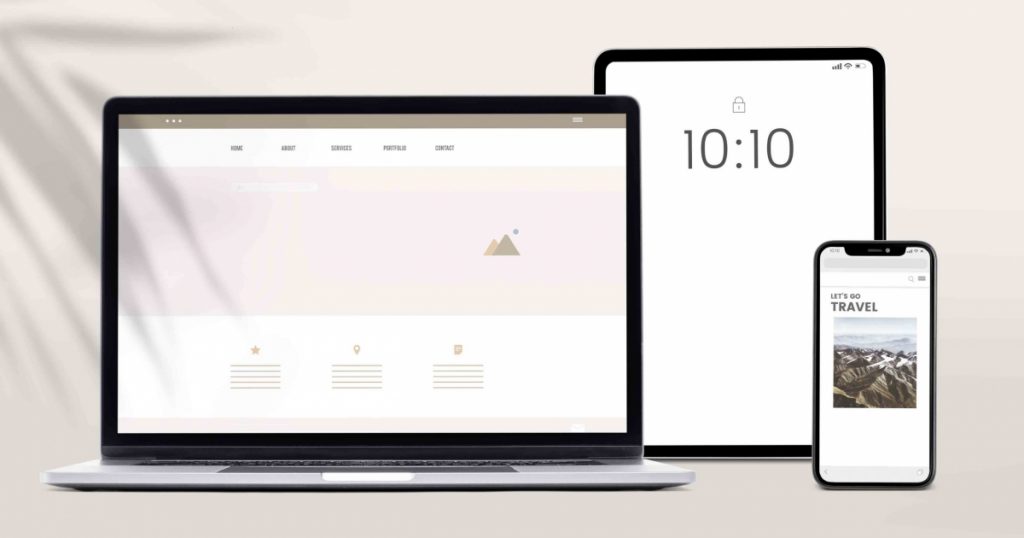
One of the more obvious differences between a desktop and mobile design is the screen size.
Desktop designs have larger screens, so you pretty much have more liberty to add content. It often makes use of full navigation bars.
Mobile designs, on the other hand, have a smaller screen. So instead of full navigation bars, it uses pull-down menus to maximize the space.
Mobile design limits the content that you can show. Thus, it’s very crucial to decide which images or content to feature.
Functionality: big tasks vs. experimental
If you are going to do longer tasks, a desktop design will be more suitable. Mobile designs limit the number of functions that you can use at a time. It lacks functionality.
But while it lacks functionality, it is quite ingenious and creative. It offers modern and inclusive features that you will not find on a web design such as multiple cameras, virtual reality, and augmented reality.
Organizing content: columns vs. scrolling
Desktop designs will show content arranged in a traditional multi-column format, just like what you see in printed magazines. Thus it allows for more functionality in terms of design layout.
Mobile designs, on the other hand, use long scrolling for longer content. This conserves the limited screen space without sacrificing the length of the content.
You may also be able to switch between portrait and landscape views. However, this will mean twice as much work for the designer.
Interaction: cursors vs. gestures
Desktop designs make use of full cursor activity. Since the screen is bigger and you can put as much content as you wish, you can fill the screen with pictures and have descriptions on the hover.
You will not be able to use the same technique for mobile designs. It, however, uses gestures such as swinging, sliding, and even shaking. And a lot of users seem to find it fun.
Get in Touch
Do you find this article helpful? For more information or questions, click the button to send us a message.
If you have any comments or suggestions, feel free to share them with us, too!