The main reason people visit websites is the content. It means many people prefer a website that offers informative content. The design and how the content is presented are significant. Aside from being informative, creative, and unique, the content must be visually appealing. This way, it can attract users to read it.
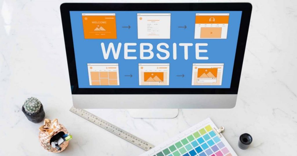
Designing an informative website layout is the first thing designers do when creating a website. The layout is significant to a website so that it can drive visitors.
Here are some of the website layouts that never grow old.
1. Single column
The single-column layout is the basic design but is more popular because of its mobile compatibility. This layout is used for desktops, tablets, and mobiles. It offers a great reading experience, reduces costs, and saves time. Visuals and images have a powerful impact when integrated with a single-column layout.
2. Featured image
It is considered the most effective layout design. Even a single big featured image can create a stunning impression and strong statement. The main objective of this layout design is to create an emotional connection and encourage quick buying decisions.
3. Split screen
This layout design is ideal if the web page is divided into two. A split screen layout is ideal if a page has two pieces of content with equal importance. The users can choose from the two different areas. It has the limited option, but when used correctly it can be visually attractive and beneficial.
4. Asymmetrical
This website layout design is similar to the split-screen format. Both have split sections and layouts on the screen. They vary in the way they are separated. The asymmetrical layout divides the screen into several sections.
5. Magazines
Obviously, this layout design is used in magazines and news websites. Ideal for summarizing a huge number of stories or news using images and headlines. Using this layout requires the designer to make it clear and simple to avoid confusing the users. It must be easy to navigate. Designers use grid systems or modular grids to make the layout more flexible.
6. Boxes
Connecting boxes can tell a story. The large box is for showcasing products and the smaller box is for the information about the product. It is a versatile layout design for e-commerce websites and individual portfolio-like sites.
Takeaway
Content is king when designing a website. Thus, it is essential to ensure that the content is easy to digest. Always use a layout design that will make the content stand out.
Get in Touch
Do you find this article helpful? For more information or questions, click the button to send us a message.
If you have any comments or suggestions, feel free to share them with us, too!